
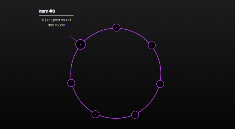
HTML5 SVG圆形布局文字菜单导航特效,可在线编辑修改预览
<!DOCTYPE html>
<html lang="zh">
<head>
    <meta charset="UTF-8">
    <meta http-equiv="X-UA-Compatible" cBfwOntent="IE=edge,chrome=1">
    <meta name="viewport" cBfwOntent="width=device-width, initial-scale=1.0">
    <title>HTML5 SVG圆形布局文字菜单导航特效</title>

    <!--可无视-->


    <!--核心-->
    <style>
        * {
            margin: 0;
            padding: 0;
            border: 0;
            outline: none;
            box-sizing: border-box;
            font-family: "Poppins", sans-serif;
        }

        html,
        body {
            height: 100vh;
            width: 100vw;
            background-color: #000;
            background: linear-gradient(#1F1F21, #000);
        }

        .main {
            display: flex;
            height: 100vh;
            width: 100vw;
            flex-wrap: wrap;
            flex-direction: column;
            justify-content: center;
            align-items: center;
        }

        .navigation-circle {
            display: block;
            position: relative;
            height: 320px;
            width: 320px;
            margin: auto;
        }
        .navigation-circle__inner {
            display: block;
            position: relative;
            height: 100%;
            width: 100%;
        }
        .navigation-circle__list {
            display: block;
            position: absolute;
            height: 320px;
            width: 320px;
            transform: rotate(-90deg);
            animation: 2.2s cubic-bezier(0.25, -0.25, 0.35, 1) 0 1 animate-in-list forwards;
        }

        .navigation-circle-svg {
            display: block;
            position: absolute;
            top: 0;
            right: 0;
            bottom: 0;
            left: 0;
            transform: rotateZ(-90deg);
        }
        .navigation-circle-svg--opaque {
            opacity: 0.5;
        }
        .navigation-circle-svg--mask circle {
            transition: all 0.5s ease;
            transition-delay: 0.5s;
            animation: 2.2s ease 0 1 animate-in-svg-circle-mask backwards;
        }

        .navigation-circle-list-item {
            display: block;
            position: absolute;
            height: 0;
            width: calc(50% + 16px);
            top: 50%;
            left: 50%;
            list-style: none;
            transform-origin: 0 0;
        }
        .navigation-circle-list-item__point {
            display: block;
            position: absolute;
            height: 32px;
            width: 32px;
            top: -16px;
            right: 2px;
            cursor: pointer;
            transform: scale(0);
        }
        .navigation-circle-list-item__point:before {
            content: "•";
            display: block;
            position: absolute;
            height: 32px;
            width: 32px;
            top: 0;
            color: #c644fc;
            background-color: #000;
            font-size: 12px;
            font-weight: 400;
            line-height: 32px;
            text-align: center;
            border: 2px solid #c644fc;
            border-radius: 50%;
            box-shadow: inset 0px 0px 0px 0px #c644fc;
            transform: scale(0.75);
            transition: all 0.5s ease;
        }
        .navigation-circle-list-item__point:after {
            content: "";
            display: block;
            position: absolute;
            height: 1px;
            width: 0px;
            top: 18px;
            left: 31px;
            background-color: #c644fc;
            transition: all 0.5s ease;
        }
        .navigation-circle-list-item__meta {
            display: block;
            position: absolute;
            overflow: hidden;
            opacity: 0;
            transform-origin: center;
            margin-left: 78px;
            min-width: 128px;
            padding: 4px;
        }
        .navigation-circle-list-item__title {
            display: block;
            color: #f7f7f7;
            text-align: left;
            font-size: 14px;
            border-bottom: 1px solid #f7f7f7;
            padding-bottom: 4px;
            margin-bottom: 6px;
        }
        .navigation-circle-list-item__subtitle {
            display: block;
            color: #f7f7f7;
            text-align: center;
            font-weight: 200;
            font-size: 12px;
        }

        .navigation-circle-list-item:nth-of-type(1) {
            transform: rotateZ(calc((360deg / 7) * 1));
        }

        .navigation-circle-list-item:nth-of-type(1)
        .navigation-circle-list-item__meta {
            transform: rotateZ(38.5714285714deg);
        }

        .navigation-circle-list-item:nth-of-type(1)
        .navigation-circle-list-item__point {
            animation: 1s cubic-bezier(0.55, -0.3, 0.6, 1.5) 0s 1 animate-in-list-item-point forwards;
        }

        .navigation-circle-list-item:nth-of-type(2) {
            transform: rotateZ(calc((360deg / 7) * 2));
        }

        .navigation-circle-list-item:nth-of-type(2)
        .navigation-circle-list-item__meta {
            transform: rotateZ(-12.8571428571deg);
        }

        .navigation-circle-list-item:nth-of-type(2)
        .navigation-circle-list-item__point {
            animation: 1s cubic-bezier(0.55, -0.3, 0.6, 1.5) 0.2s 1 animate-in-list-item-point forwards;
        }

        .navigation-cir...
点击查看剩余70%


 {{collectdata}}


网友评论0